Halloween Color Palettes for Decor, Invitations and Design
Find coordinated Halloween color palettes for invitations, room decor and graphics, from classic orange to muted modern shades.
Halloween Color Palettes for Decor, Invitations and Design
A Halloween color palette should do more than name orange and black. It needs a usable balance between a background, a main color and an accent so that a table, poster or doorway looks deliberate rather than noisy. These example combinations can guide physical décor and digital designs.
Classic Orange and Black Palettes
For a classic palette, start with charcoal #24252A, pumpkin orange #D97828 and cream #F3E8D2. A rough 60/30/10 balance—neutral background, orange middle layer, small light accent—works for signage and table styling. Use dark text on a light field for anything people must read; color balance does not replace contrast testing.
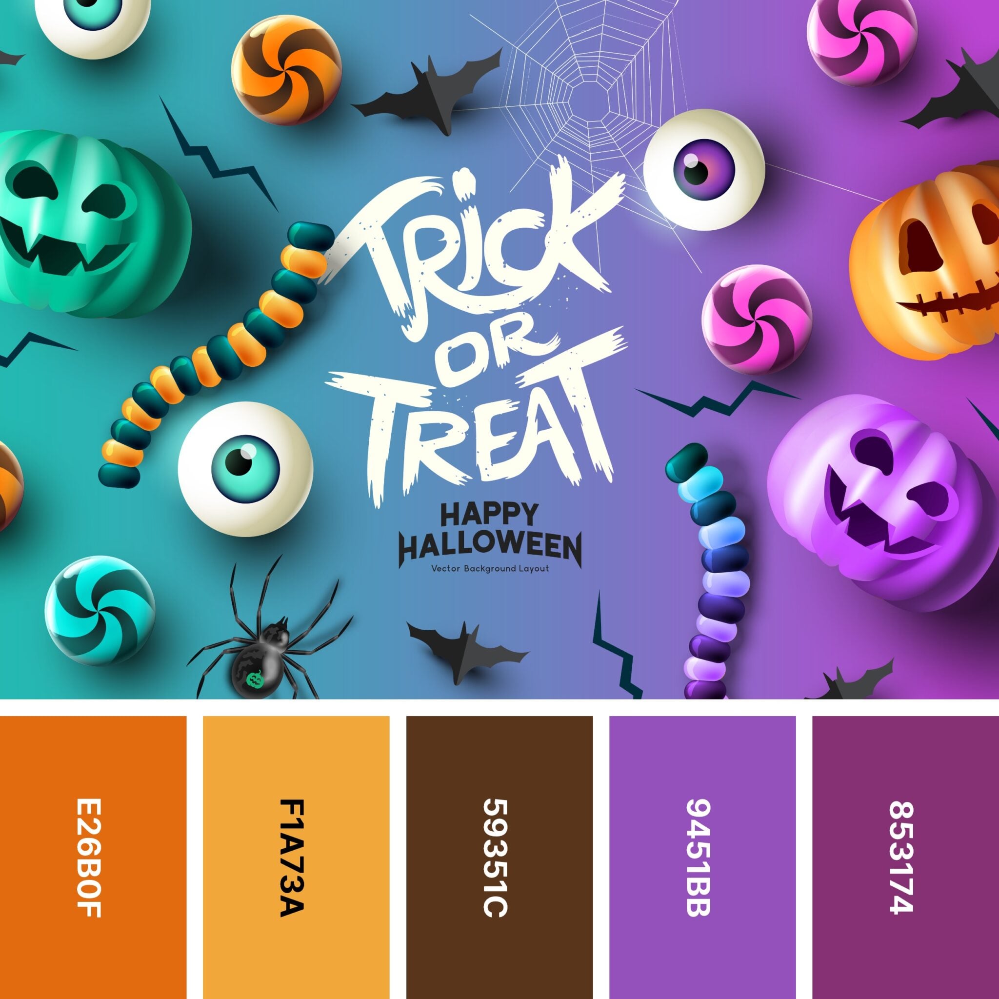
A palette worksheet can use four boxes: dominant color, supporting color, highlight and text color. Write your chosen hex codes in each box and check them on both paper and a screen. If printing a flyer, select a light area for critical information and use a tested dark text color. If decorating a room, compare the swatches with existing furniture to avoid buying unnecessary fabric or props. Photograph a small sample under the lighting you intend to use. When colors appear different on the screen than in real life, revise before preparing every item. A coherent design uses restraint as much as creativity.
When a palette moves from digital design to a physical room, texture changes its appearance. Cream fabric, cream plastic and cream paper may reflect light differently. Test at least two actual materials beside each other before committing to a full display. The same colors can feel dramatically different under daylight and orange party lights.
Modern Muted Colors
A modern muted palette could combine deep olive #37413B, dusty terracotta #B66D50 and warm ivory #F0E4D1. This fits dried foliage, candles with safe alternatives and textured fabrics. Swap the terracotta for burgundy if the existing room already has strong orange accents. Test swatches together under the actual lighting.
Cute and Bright Variations
For a playful party, try violet #6E4C99, lime #B4D45F and near-black #202027. Keep the bright green in small labels or balloons rather than on every surface. A cute palette can use peach #F7BDA7, lavender #C9B8EC and soft cream #FFF3E3. These designs lean more friendly than frightening.
Using Colors in Decor and Print
Before printing invitations, verify text contrast and check whether the palette still works without perfect color perception. For a porch, bright colors can disappear under yellow light; for a worksheet, very pale text may become unreadable. Make a small mockup and adjust the most important headline first.
Build a test board before buying supplies: arrange a paper swatch, a fabric swatch and one light source. Place the colors next to an existing chair, table or wall to see whether the idea works in your room. Photograph it both in daylight and after dark. What reads as dark forest green at noon may appear almost black under warm evening lights.
A more restrained palette could pair midnight blue #17223A, muted copper #B5794C and ivory #F3EAD8. This combination reads autumnal without using neon shades. For a kid-friendly invitation, try teal #2C9A9A, orange #ED9458 and cream #FFF1D6. These are illustrative design suggestions, not certified accessible pairs; verify text contrast with an actual testing tool before publishing.
A useful way to apply these ideas
Make one small version first, then adjust it for your audience, space and resources. The following checks are specific to this topic; use them as a short planning pass instead of assuming every example fits every situation.
Practical takeaways
Choose one background, one primary accent and one small highlight.
Test samples under real room lighting.
Ensure legible text contrast independently of decoration style.
Use different palette ratios for posters versus rooms.
What are modern Halloween colors? Muted terracotta, olive, cream and burgundy can make a modern alternative to orange and black.
Related Halloween guides